SOLMED
HEALTHCARE BRANDING
01
CONCEPT & VISION
Solmed™ is a premier healthcare brand based in the United States, focused on combining advanced medical technology with compassionate, patient-first care. The identity was shaped around a clear promise: to make modern healthcare feel more human, reliable, and accessible. Across five weeks, we built a complete brand system that brings together strategic creative direction, logo design, visual language, and branded collateral into one consistent healthcare experience.
SOLMED
Client
BRAND IDENTITY
Service
5 WEEKS
Timeline


02
DESIGN PROCESS
The process began by defining the emotional balance Solmed needed to own: clinically advanced, but never cold; premium, but still approachable. We translated that positioning into a palette of antique white, copper rust, gold tips, and green pea — colors that combine warmth, care, maturity, and renewal. The logo direction focused on clarity, trust, and soft precision, while the broader system introduced structured layouts, calm typography, and refined brand assets that could work across medical, digital, and printed touchpoints.
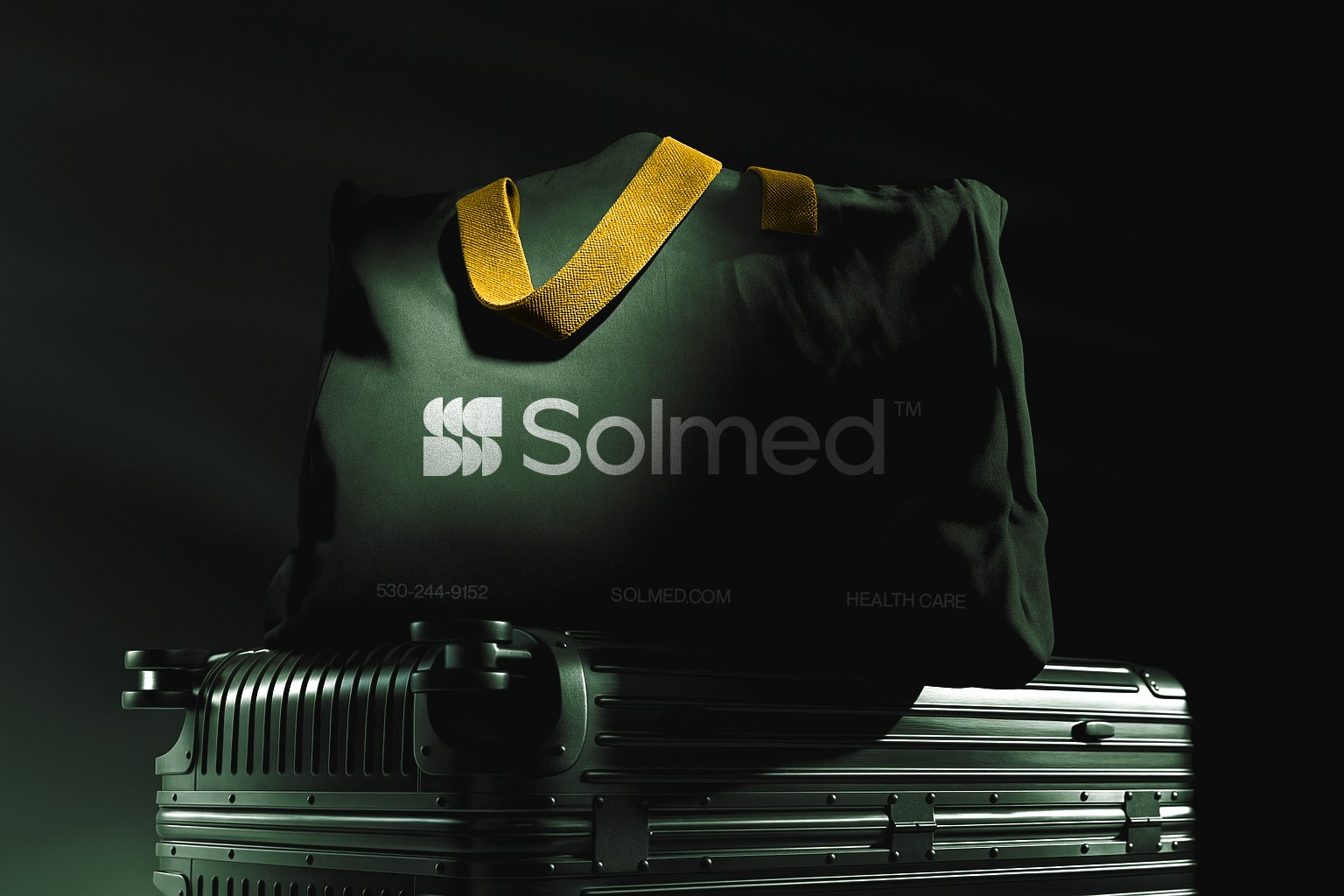
Every visual decision was designed to support trust at the first point of contact. Antique white created a clean, reassuring foundation; copper rust added warmth and distinction; gold tips introduced a premium detail; and green pea brought a sense of health, growth, and care. Together, these tones helped Solmed avoid the generic blue-and-white healthcare look while still feeling credible, safe, and professional. The final collateral system gave the brand a consistent voice across presentations, stationery, social assets, signage, and patient-facing communication.
03
OUTCOME & IMPACT
The final Solmed™ identity gives the healthcare brand a polished, trustworthy presence that aligns with its mission to heal through innovation and empathy. The system brings clarity and consistency to every visual touchpoint, helping the brand communicate advanced medical capability with a warmer human tone. From strategy to logo design and collateral, the result is a modern healthcare identity built to feel credible, compassionate, and ready for growth.
HEALTHCARE BRAND SYSTEM
2024
(BRANDING)
PATIENT-FIRST IDENTITY
2025
(BRAND DESIGN)

Apexus Collective